About Me

I am a highly creative and science-minded professional with an education in human behavior and technology interaction. Leveraged with a research-emphasis, my design style is driven by the design thinking framework and enveloped in human-centered design. I am pursing my M.S. degree in Health Communication Design at Thomas Jefferson University.
I am obsessed with immersing myself in a user's journey to fully empathize with not only how I can serve an audience, but why I should. This practice blends my neuropsychology research background with design to translate subject matter into sleek and efficient end-products for a range of marketing, promotion, and utility needs without losing sight of the guiding purpose. I excel within creative environments built on direct communications to build excellent rapport with clients and peers. I am deeply passionate about participating in meaningful work in the health sector.
When I'm not working, I enjoy reading, writing, photography, and painting. Check out my book, Sunflowers, on Amazon.
TLDR: I am a multi-faceted visual designer with a neuropsych background. I am pursuing my Master's degree in Health Communication Design at Thomas Jefferson Unviersity.
Download my resume
Health Communication Design
Perinatal Mental Health Awareness
Working with Dr. Aparna Kumar of Jefferson College of Nursing and funded by The Stratton Foundation, I developed this poster to accompany her standard research poster as part of a collaboration between the College of Nursing and the Health Communication Design Program at Jefferson.
Maternal mental health is known to negatively impact pregnancy outcomes for both mother and baby. Nearly half of all mothers experience mental health symptoms but these are typically screened for after the baby is born. Dr. Aparna Kumar’s research suggests that the Edinburgh Postpartum Depression Scale (EPDS) can detect symptoms outside of depression and can identify these signs during pregnancy. The EPDS is only ten questions, free to use, and translated into many languages. If the scale is utilized earlier in a mother’s pregnancy, adequate care to prevent further complications may be possible.
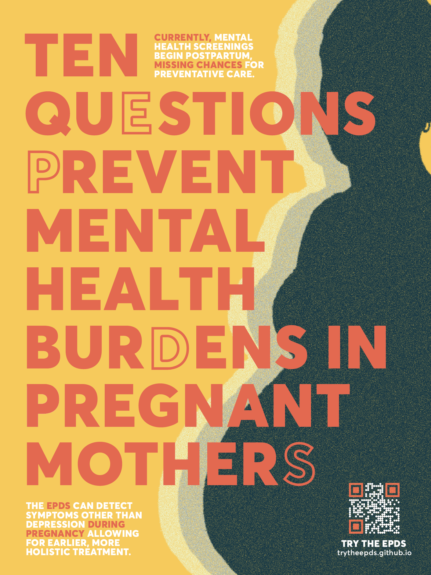
This poster works to provide awareness for the more global use of the EPDS during pregnancy, specifically targeting obstetric care providers who likely are familiar with the tool. Based on preliminary results from this research, the EPDS may successfully detect not only depression, but also PTSD, anxiety, and bipolar disorder symptoms. This is significant because the EPDS is free to access, available in a variety of languages, is already commonly used in postpartum care, and most importantly, it is only ten brief questions.
The QR code on the poster takes the viewer to an online version of the EPDS. I developed this to give the user a sense of how quickly the ten question scale can be administered as another nod to its feasibility. It also provides someone who may not know about the EPDS with a score based on the EPDS’s scoring logic to understand the experience that a mother would have while filling this out.
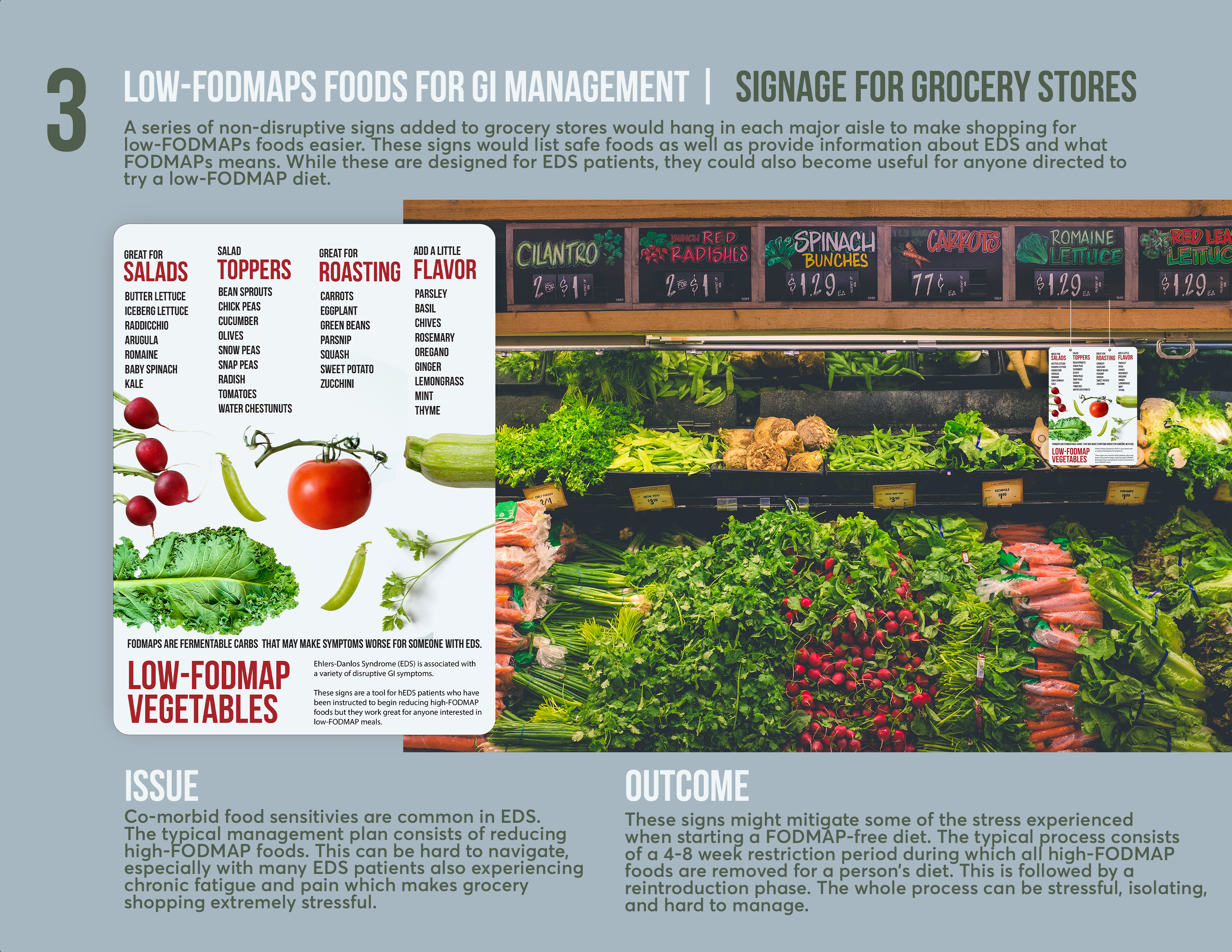
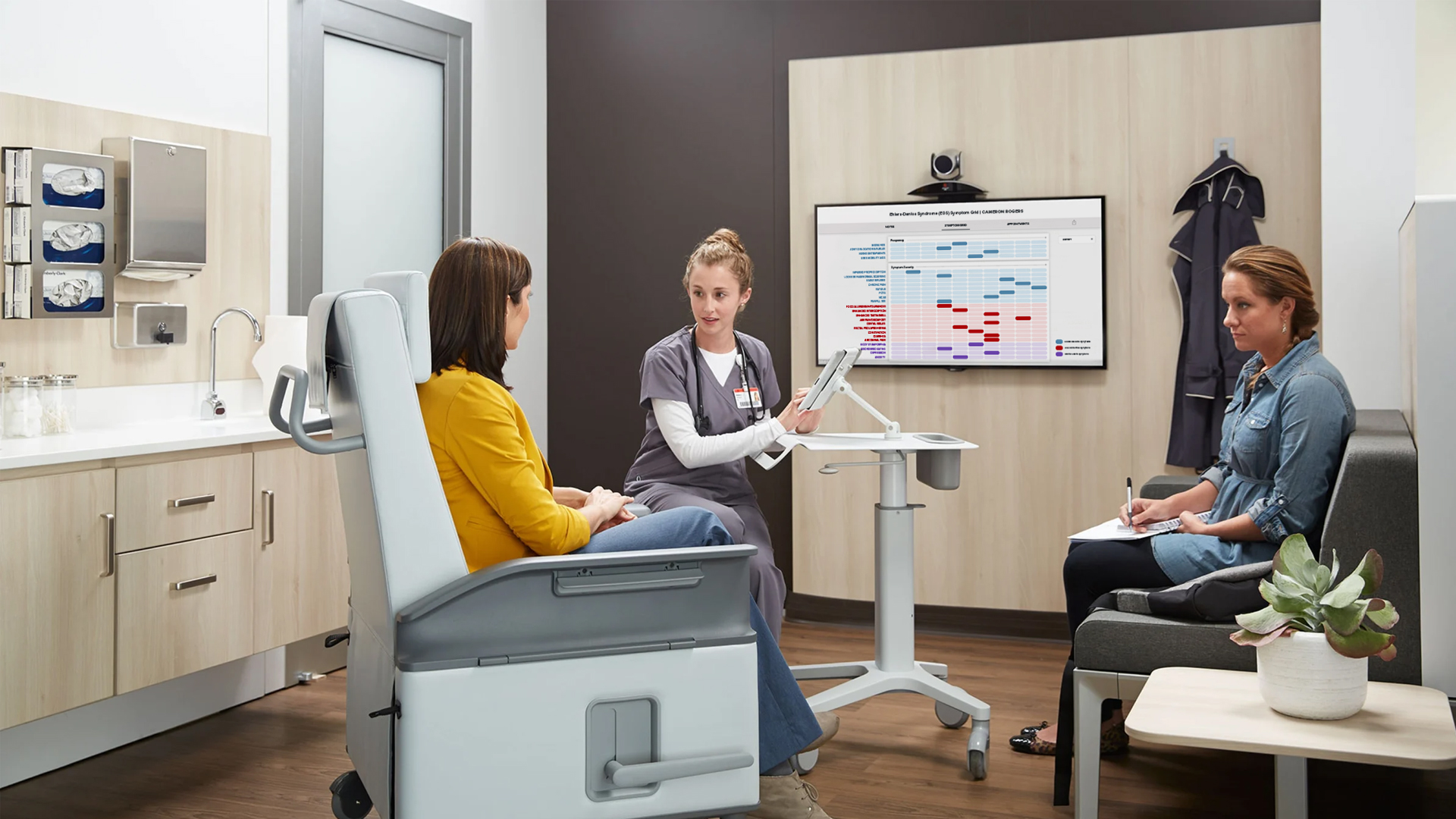
Ehlers-Danlos Syndrome Grid
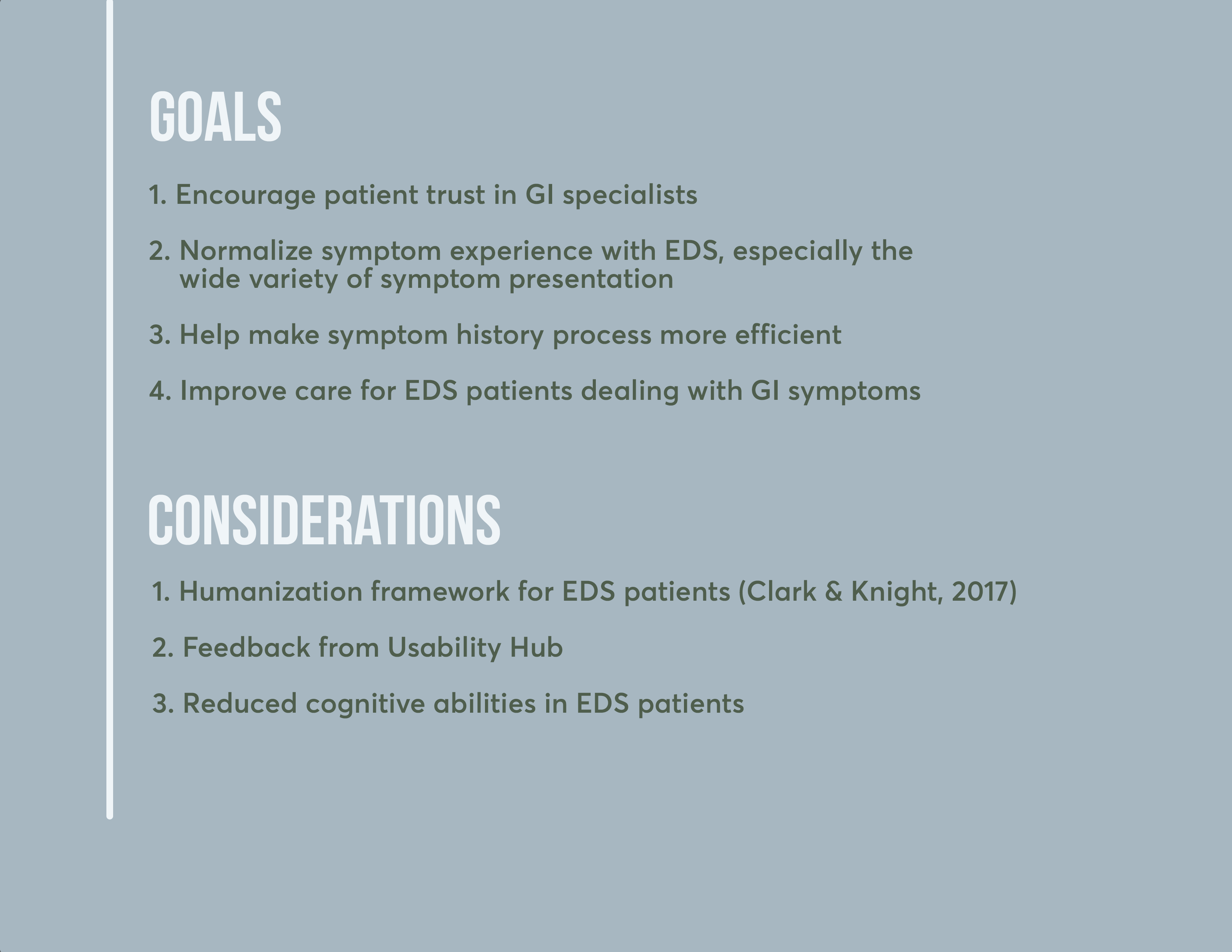
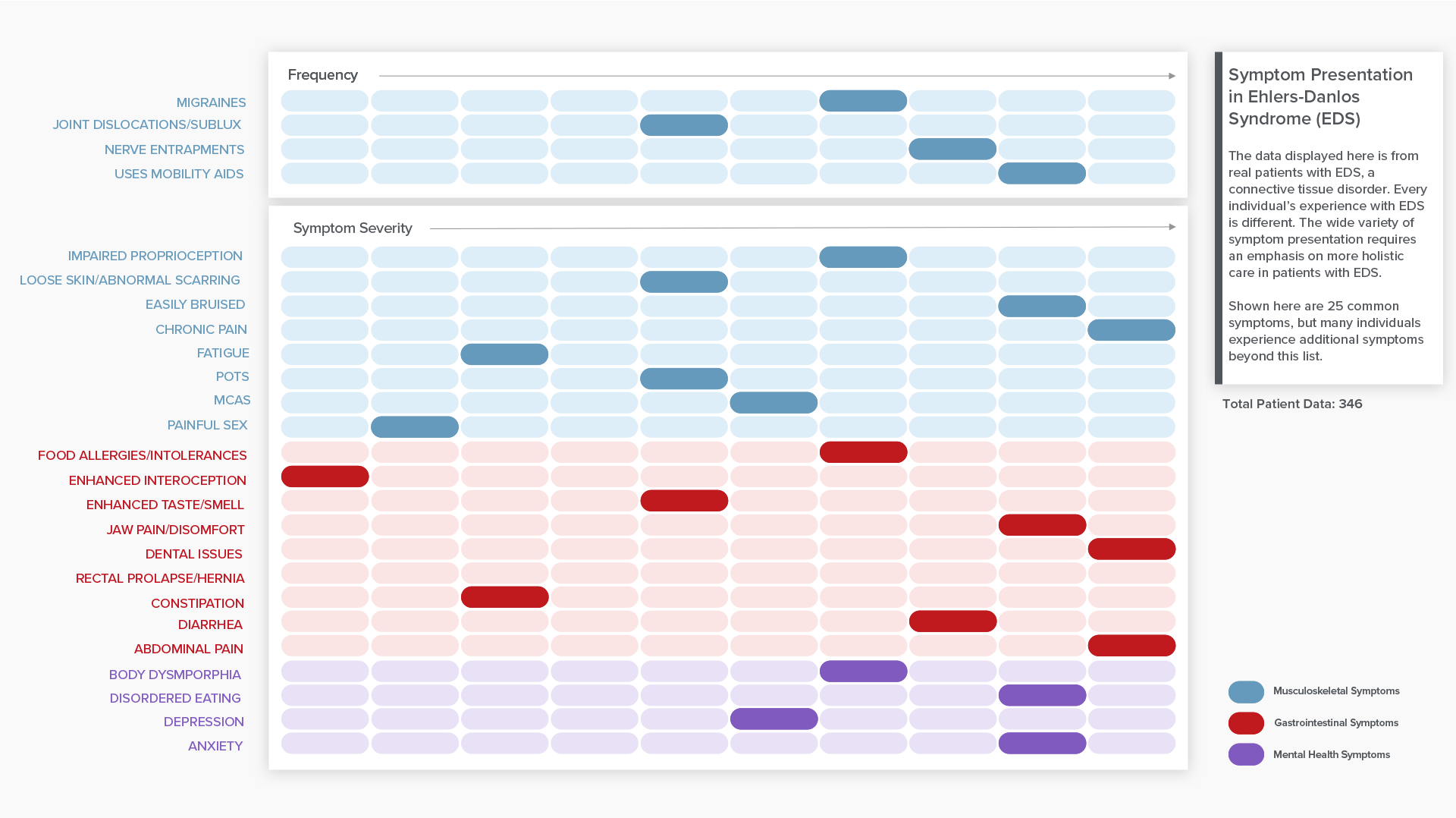
Ehlers-Danlos Syndrome (EDS) is a connective tissue disorder that affects the entire body in patients who present with the disorder. Common symptoms include pain, fatigue, cognitive limitations, mobility issues, gastrointestinal issues, and mental health co-morbidities.
The scope of this project was to improve the management of GI symptoms in patients with EDS. My ideation phase culminated into three iterations of visual communications that could improve the management of these symptoms.
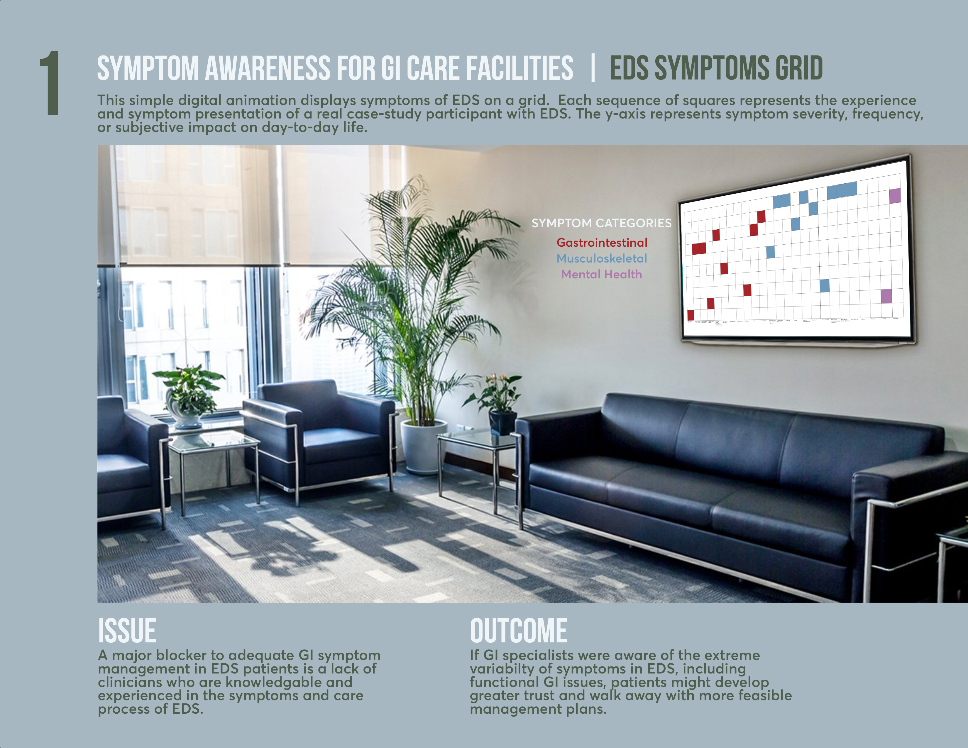
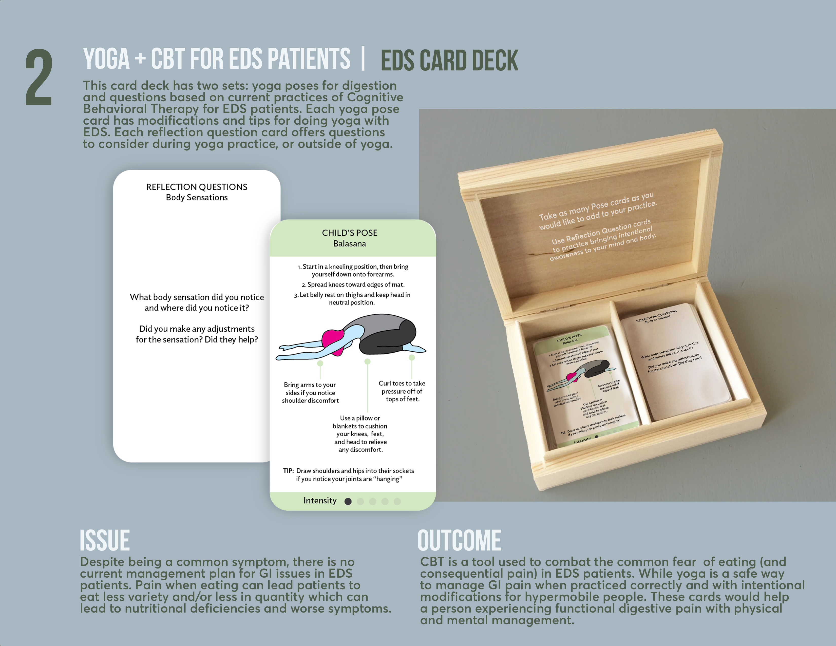
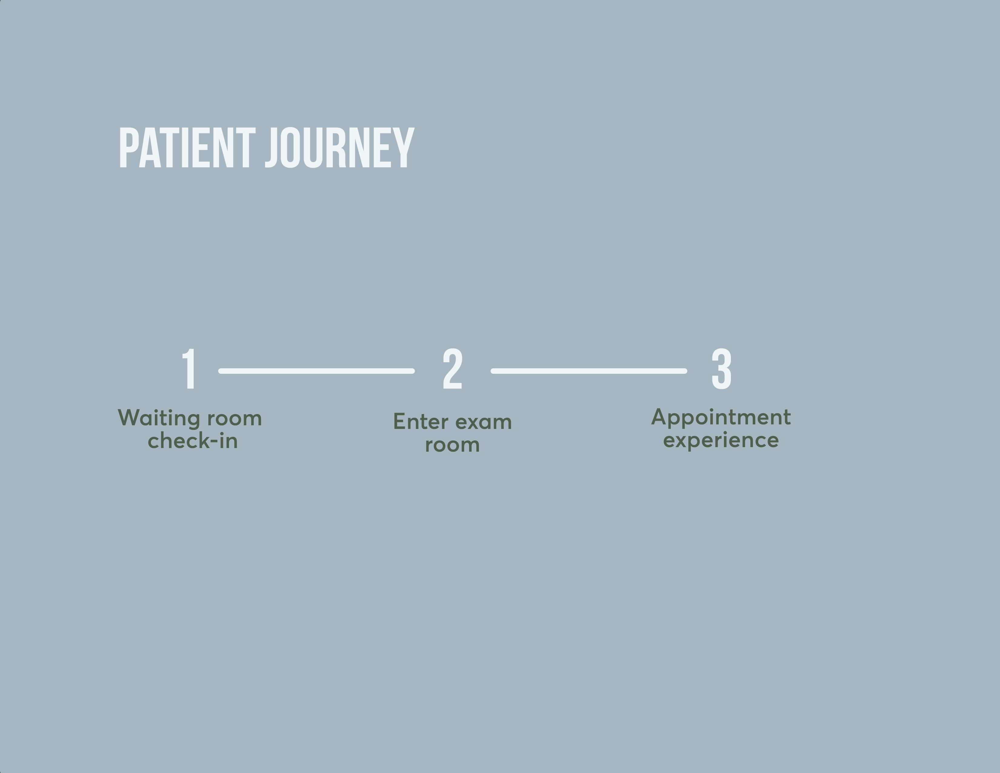
Through feedback testing, I moved forward with the EDS Grid and developed a tool that could be used between patients and physicians to open up communication and visualize symptom history for improved multi-discplinary care. This tool is designed to interact with three points of a patient's journey and follows research on Humanization Theory for EDS patients while addressing four main problems during care.
Designed on Sketch and prototyped with Marvel.
The first touchpoint is through an EDS specific quesionnaire meant to accompany the common check-in procedures using an iPad.
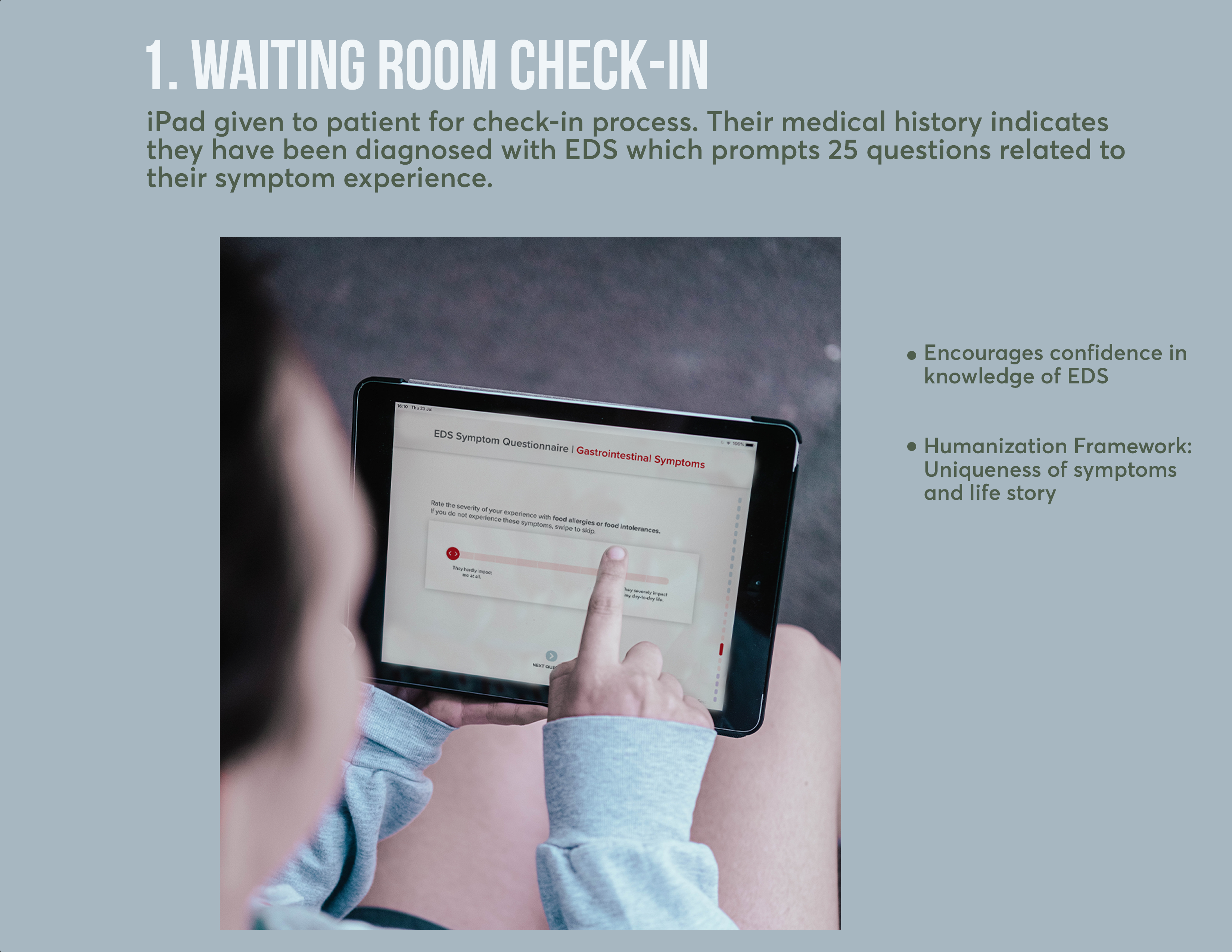
The data from patients' check-in questionnaires can be sent to a anonymized view of rotating data. This could be displayed in the exam room prior to the physician coming in, or it could be utilized in a lobby or university. The aim here is to normalize the wide variety of symptom presentation and severity in EDS patients.
The final touchpoint is during the exam. The GI specialist can view overall symptoms and symptom history as a visual tool to talk through next steps of care or maintenance with the patient. This can be shared with the patient to take off pressure of needing to remember everything discussed.
Branding
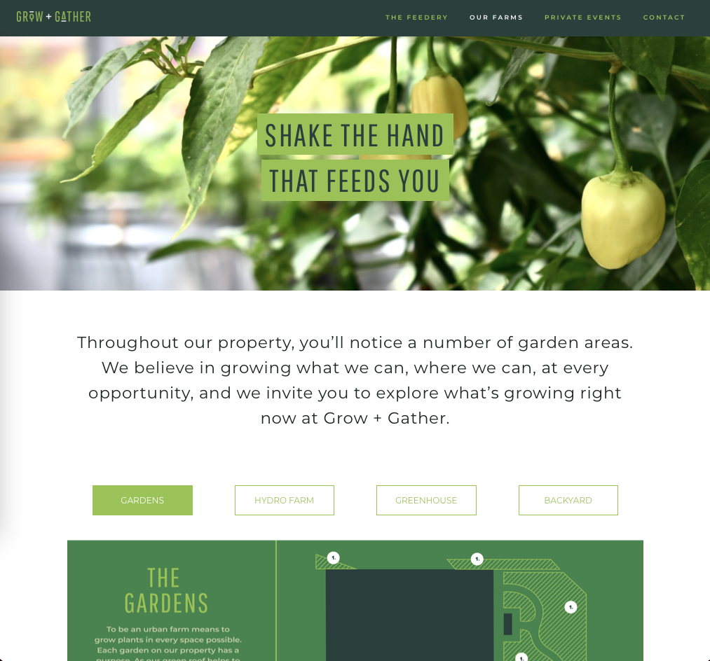
Grow + Gather
Grow + Gather is an urban farm, restaurant, and marketplace in Englewood, CO. With a desire to serve the community and bring the heritage as well as the growth of Englewood together, branding for Grow + Gather centers around approachable and community-oriented messaging paired with a sophisticated but sincere take on agriculture.
Website Re-design
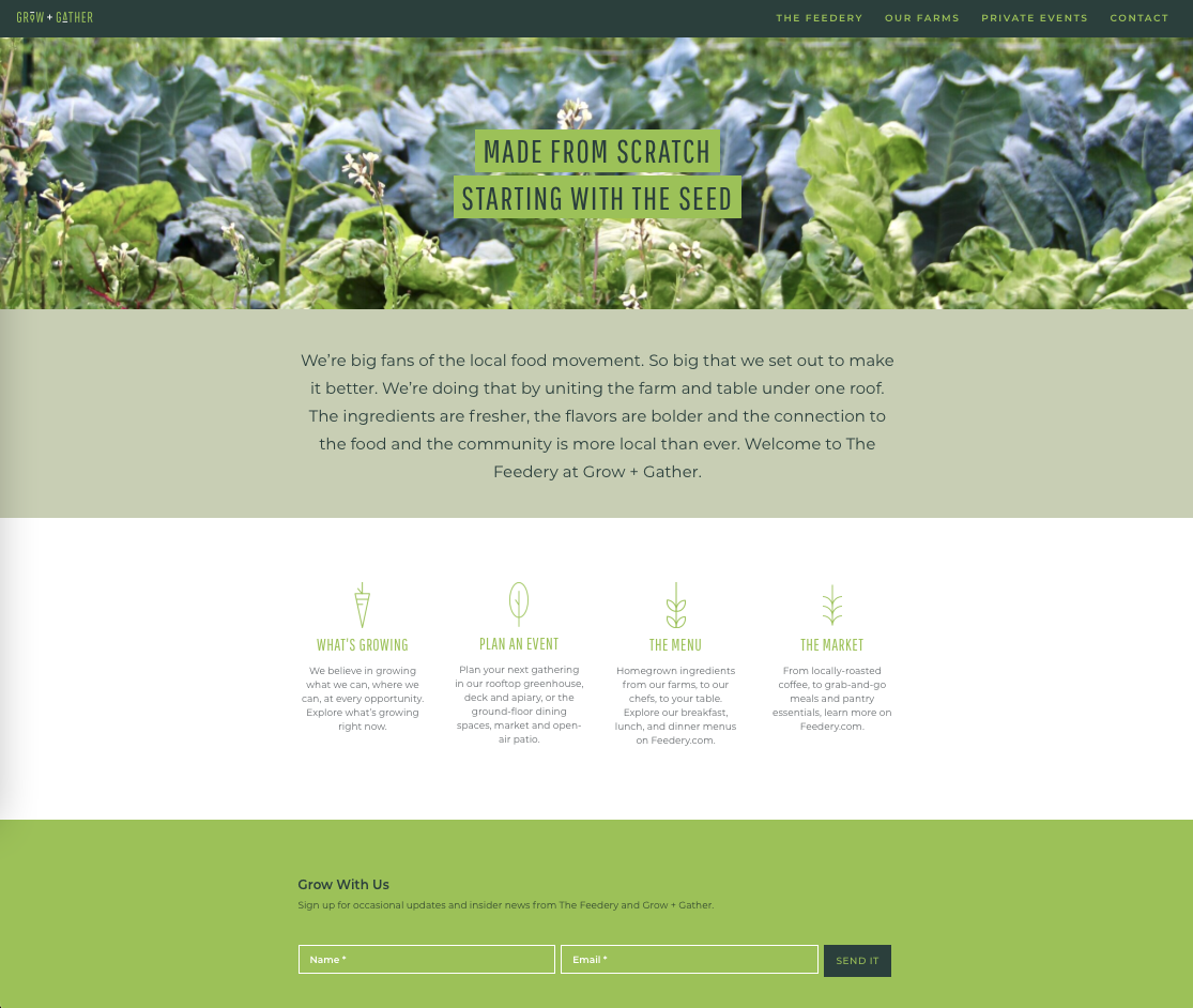
While Grow + Gather is the overachring farming operation and the space itself, The Feedery brand represents the restaurant and market. These two brands, while relying on each other, caused inital confusion as they lacked differentiation and consistency. This sparked a website redesign at growgather.com that provided the information most sought after when users arrived at the site. The information set on the landing page was determined by user interactions gathered from Google Analytics.
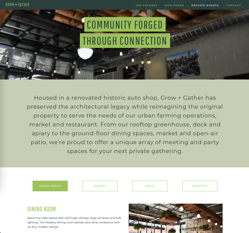
I also worked to create consistency petween pages on growgather.com and developed a tab system to create a more streamlined user experience while showcasing unique aspects of the comapny, such as the onsite farms and event spaces, two parts of the business that attract different users to the site.
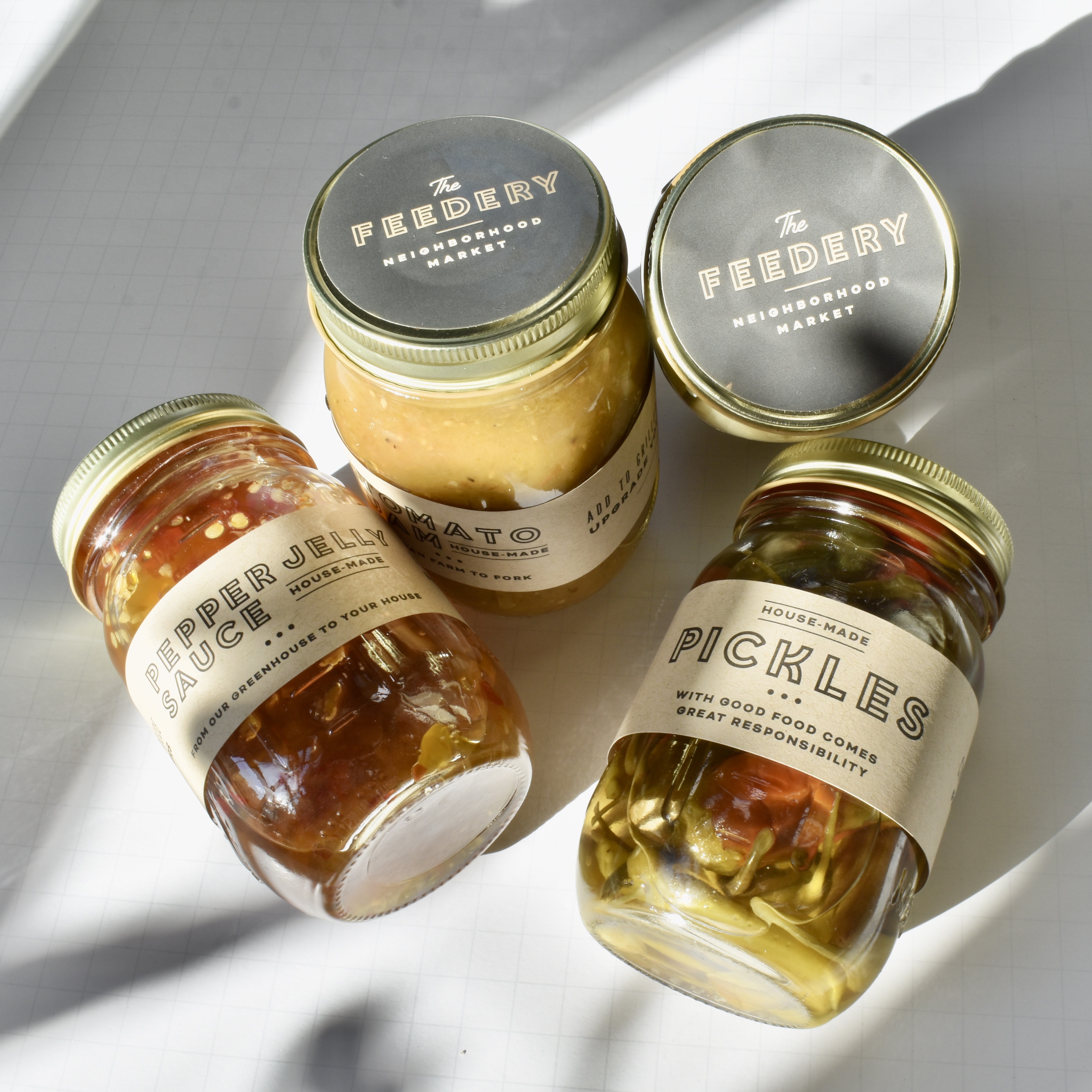
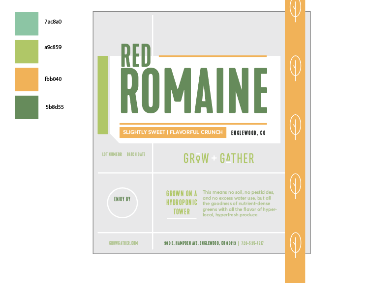
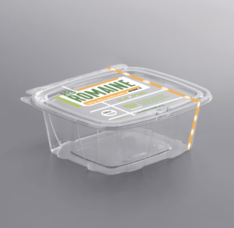
Packaging
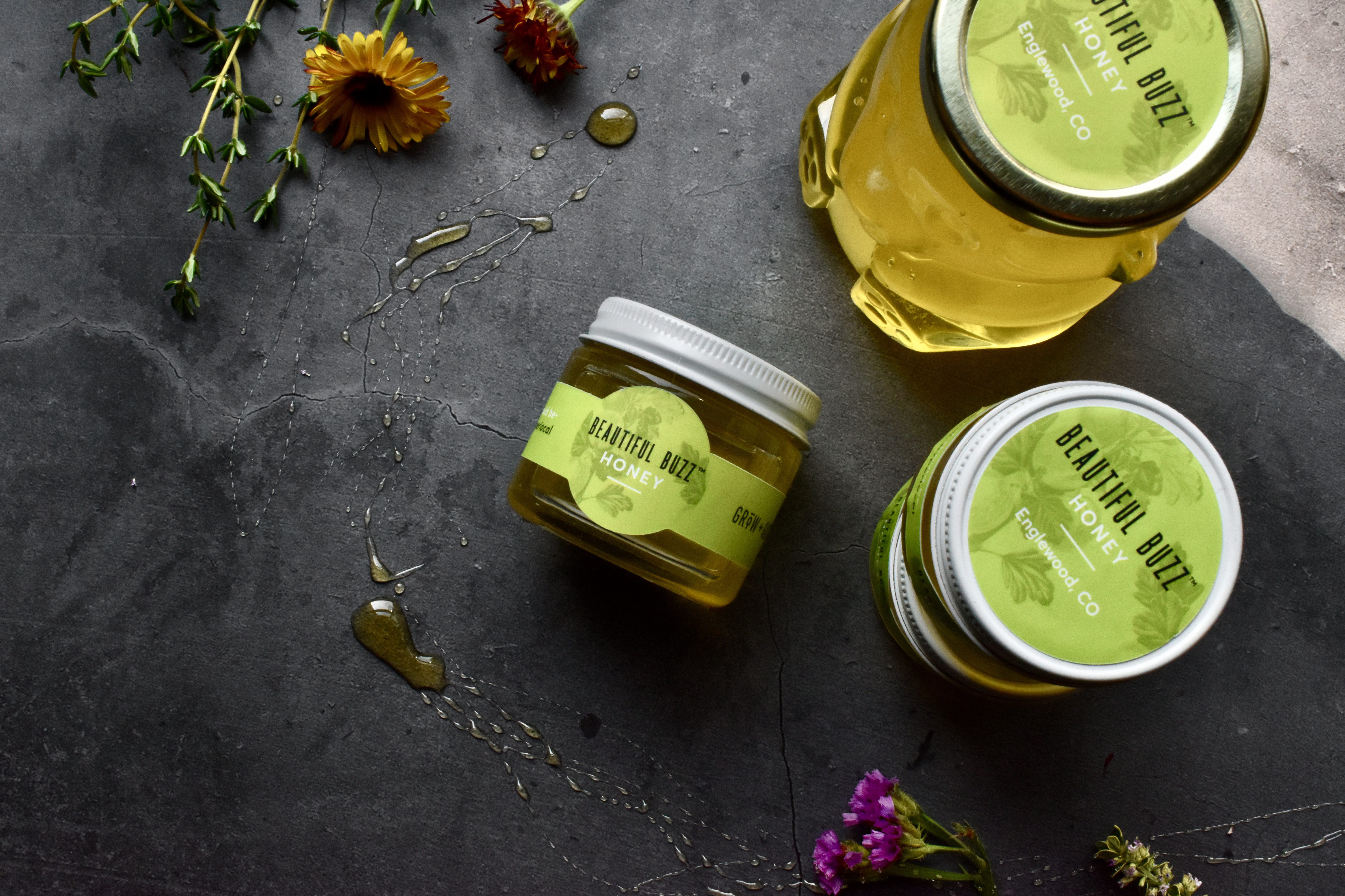
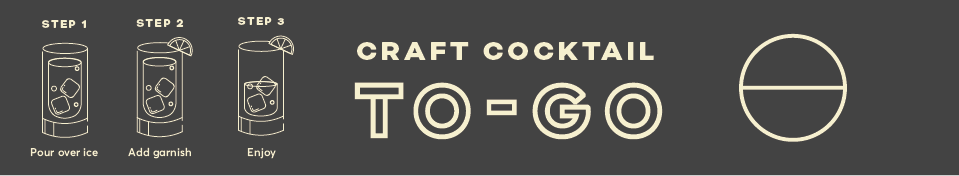
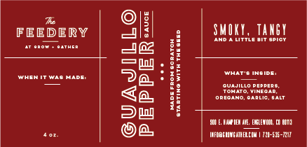
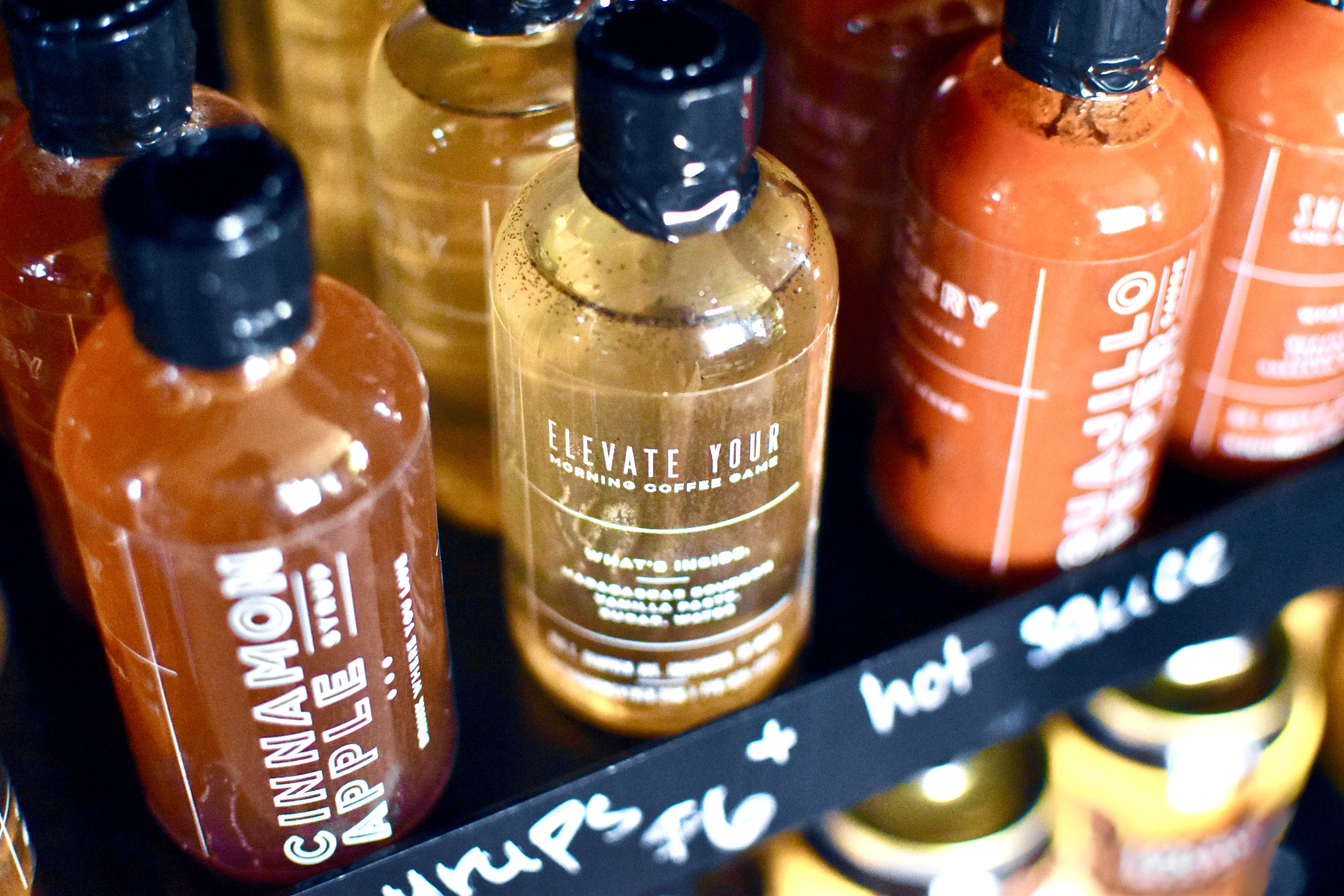
Designing at the speed of nature has been a beautiful challenge - as honey arrives from the bees, there becomes a need for jar labels. As lettuce grows and the kitchen has extra product to make syrups and preserves, new branding needs are born. Here are some of these creations - from development to product launch, marketing, and promotion, I have created and maintained each project myself.
Beautiful Buzz Honey

Covid-style To Go Cocktails
Hot Sauces + Simple Syrups
Pickles + Preserves
Lettuce
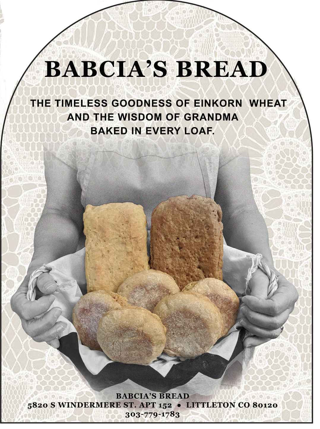
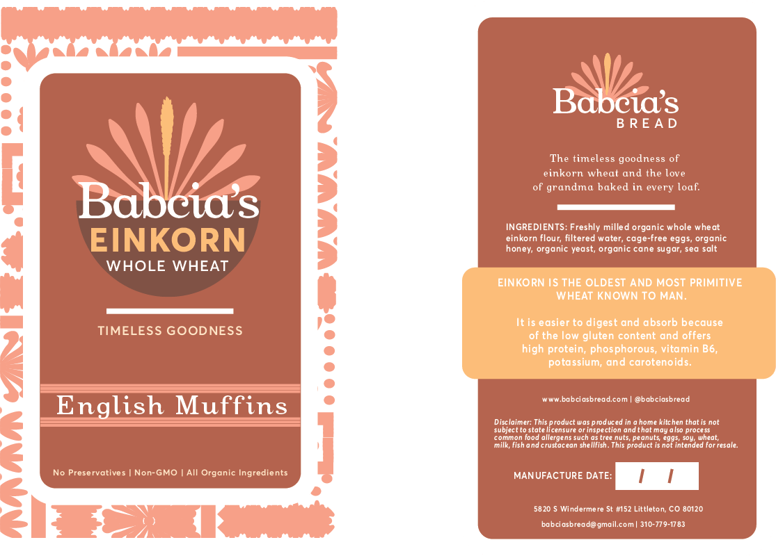
Babcia's Bread
As a one-woman owned cottage-industry business, the message behind this brand was inpsired by my interactions with the owner who is a vibrant story-teller, a spiritual and charity-driven individual with an outspoken pride of her Polish heritage. All design decisions were made with future ease of maintenance in mind - with no staff �or brand manager, she would need to easily source additional packaging, create website edits, and develop new materials once I �finished my contract with her.
The Original Label
Re-designed Brand

Babcia's Bread Brand Guidelines
We spent a lot of time working on her brand message. She enjoyed having control over the writing, tone of voice, and mission statement but lacked the clarity of what it means to turn a purpose into a message. I asked her to describe what came to mind when I said four statements: 1) Our mission, 2) Our promise, 3) Our essence, 4) Our mantra. This helped to get her brain thinking in terms of relevant messaging without having had experience with this before.
UX
EngleFood
In the midst of covid, restaurants in Englewood were struggling. Many lacked a digital prescense, let alone someone to help them promote their offerings, build a website with SEO in mind, or create a Google presence. EngleFood was born with the idea of bridging customers to the restaurants who need them most.
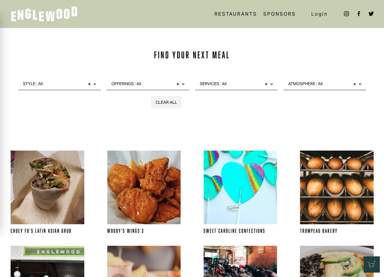
Serving as an Englewood-specific restaurant/bar discovery platform, this site needed to serve three users. First, The Merchant, or the business that would list their offerings. This site needed to be unbiased, providing equal opportunity to all restaurants and bars while also providing strategic SEO and opportunites for customers to reach out to them. Second, The Consumer, or the local customer who might be visiting the site to see what restaurants existed or to find a favorite they already have in mind. Last, The Sponsor, or the non-food and beverage business that would benefit from listing their logo on the site to gain awareness of their brand.
The Filtering System
I developed this filtering system based on competitor analysis and some informal user surveys during the development phase. These filters automatically shuffle the available restaurants so a different business can be listed at the top each time a user enters the site. These were designed for ease of use on desktop and mobile as well as designed to be relevant during the pandemic, including filter options such as outdoor seating or delivery.

The Restaurant Sign Up
With a small budget and a team of two, the sign up form serves to gather enough information to get a restaurant listed while being quick enough that it doesn't serve as a barrier to sign up.

The Sponsorship Page
Without sponsorship, there could be no marketing budget. Luckily there was enough interest in sponsoring, that an online payment system was necessary and an easy way to gain a revenue stream. The most fun part: making the sponsorship avatars.

Personal Projects
Here are personal projects that I've done to hone my skills.
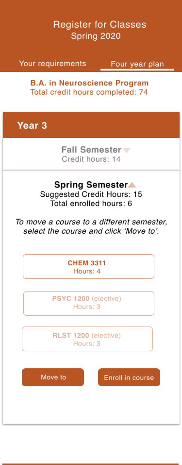
Class Sign Up Interface Prototype
The most inefficient part of college was the class sign up, especially at a large state college where there was little guidance about your four-year plan, something like this would have been amazing. Designed on Sketch and prototyped via Principle.
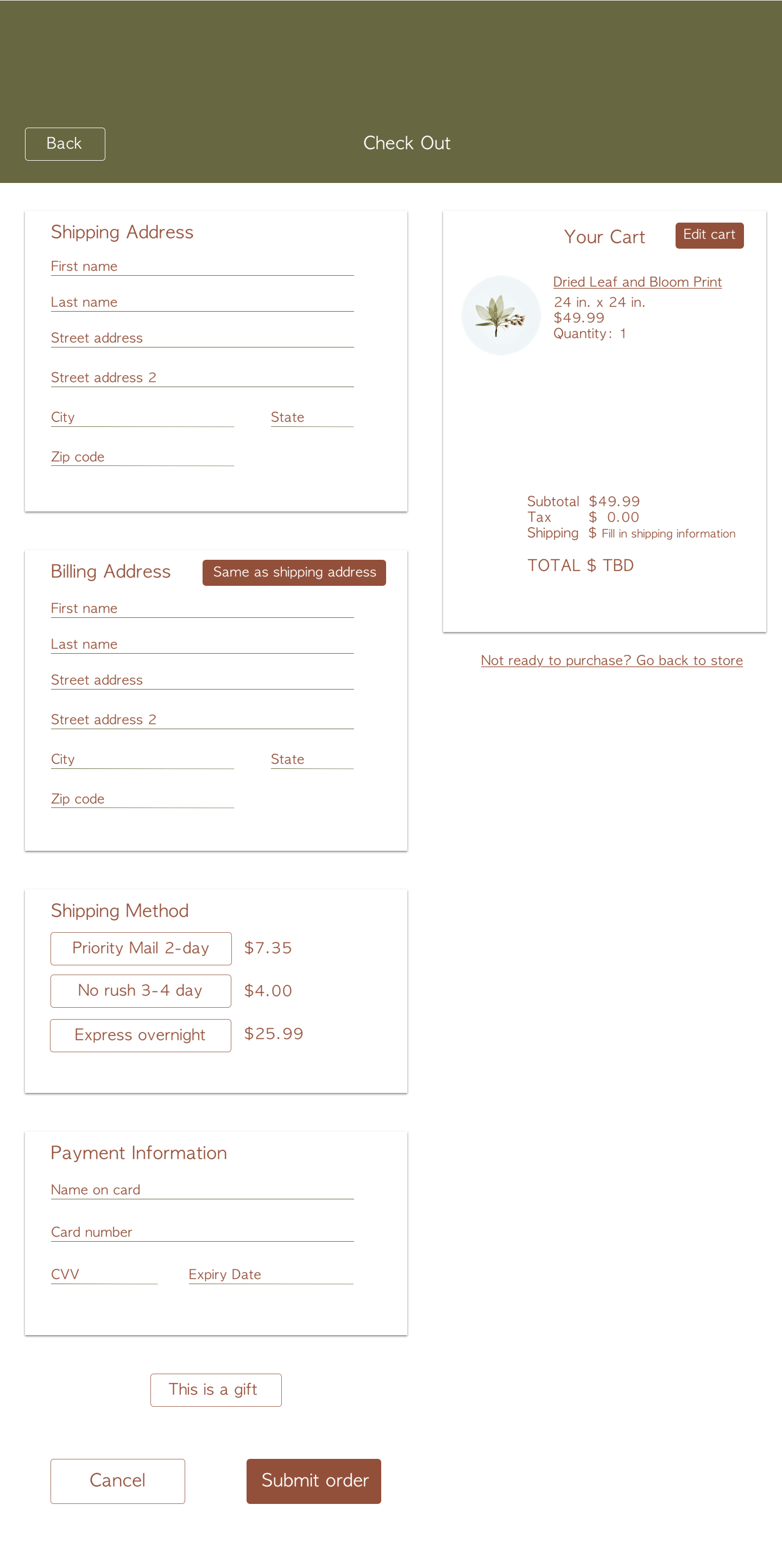
Credit Card Checkout
Here I played with Toggle Tokens instead of dropdown or check boxes for shipping prices. I feel that Toggle Tokens are easier to use for folks with mobility issues. This was designed on Sketch and prototyped with Principle.
Biophilia
A research-based app concnept designed to gamify the exploration of urban green space and heal the nature deficit in society. Designed on Sketch. For the full explanation of my process, visit my old portfolio site.
Kindle Direct Publishing 2.0
My goal for this concept was to clesn up the author experience by removing excess buttons and including actions that provided important outcomes. I focused heavily on creating a more usable FAQ/Help Center which I renamed the Knowledge Base. Additionally, I improved the Bookshelf page by removing the need for the current Author Central and instead incorporating the ability to see reviews and make changes to all books. The Author Pages section enhanced the current Author Information you can include on Amazon. This could be utilized to sell an author's story or public persona and become more personalized. I received iterative feedback from r/selfpublish on Reddit to inform my decisions. This was created on Sketch and prototyped with Marvel.
Amazon KDP 2.0 Prototype from Kirby Peterman on Vimeo.
Contact
Elements
Text
This is bold and this is strong. This is italic and this is emphasized.
This is superscript text and this is subscript text.
This is underlined and this is code: for (;;) { ... }. Finally, this is a link.
Heading Level 2
Heading Level 3
Heading Level 4
Heading Level 5
Heading Level 6
Blockquote
Fringilla nisl. Donec accumsan interdum nisi, quis tincidunt felis sagittis eget tempus euismod. Vestibulum ante ipsum primis in faucibus vestibulum. Blandit adipiscing eu felis iaculis volutpat ac adipiscing accumsan faucibus. Vestibulum ante ipsum primis in faucibus lorem ipsum dolor sit amet nullam adipiscing eu felis.
Preformatted
i = 0;

while (!deck.isInOrder()) {
    print 'Iteration ' + i;
    deck.shuffle();
    i++;
}

print 'It took ' + i + ' iterations to sort the deck.';
Lists
Unordered
- Dolor pulvinar etiam.
- Sagittis adipiscing.
- Felis enim feugiat.
Alternate
- Dolor pulvinar etiam.
- Sagittis adipiscing.
- Felis enim feugiat.
Ordered
- Dolor pulvinar etiam.
- Etiam vel felis viverra.
- Felis enim feugiat.
- Dolor pulvinar etiam.
- Etiam vel felis lorem.
- Felis enim et feugiat.
Icons
Actions
Table
Default
| Name |
Description |
Price |
| Item One |
Ante turpis integer aliquet porttitor. |
29.99 |
| Item Two |
Vis ac commodo adipiscing arcu aliquet. |
19.99 |
| Item Three |
Morbi faucibus arcu accumsan lorem. |
29.99 |
| Item Four |
Vitae integer tempus condimentum. |
19.99 |
| Item Five |
Ante turpis integer aliquet porttitor. |
29.99 |
|
100.00 |
Alternate
| Name |
Description |
Price |
| Item One |
Ante turpis integer aliquet porttitor. |
29.99 |
| Item Two |
Vis ac commodo adipiscing arcu aliquet. |
19.99 |
| Item Three |
Morbi faucibus arcu accumsan lorem. |
29.99 |
| Item Four |
Vitae integer tempus condimentum. |
19.99 |
| Item Five |
Ante turpis integer aliquet porttitor. |
29.99 |
|
100.00 |
